TEA KNOWLEDGE · ARTICLE 65
On a crowded shelf, colour helps the customer find the brand
Packaging attracts attention first; the tea inside determines whether the customer returns.

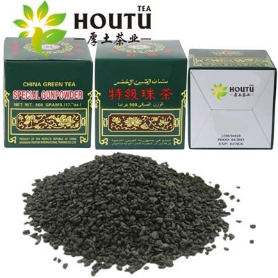
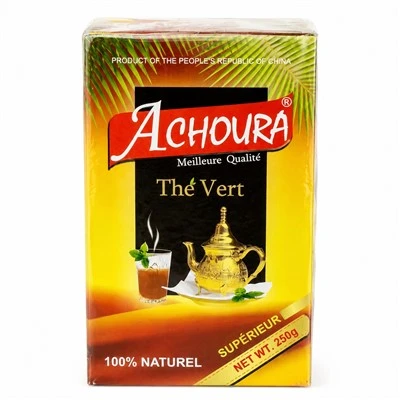
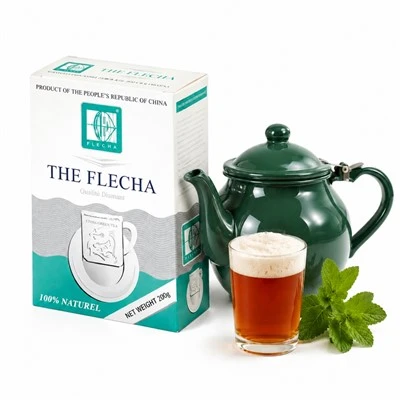
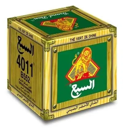
Colour helps a package attract attention and remain recognisable among competitors.
Colour communicates before the customer reads
Customers often notice colour before small text. Packaging research shows that colour influences product identification, expectations and purchase intention. Green may suggest nature or freshness, while gold may suggest premium value; these associations are not universal and can differ by market.
The best colour system is one that is distinctive, readable and consistent with the actual tea.
| Packaging goal | Colour consideration |
|---|---|
| Brand recognition | Use a stable main colour across repeat orders. |
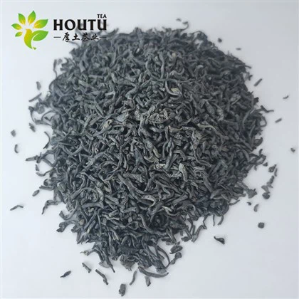
| Product differentiation | Separate Chunmee, Gunpowder or jasmine variants clearly. |
| Shelf visibility | Create contrast with nearby competitors. |
| Readability | Keep text clear against the background. |
| Market meaning | Check local cultural and category associations. |

Small formats need especially clear colour blocks and readable information.
Colour should not create a false promise
A bright green box may suggest freshness, but the product still needs proper moisture protection and a clean cup. Packaging colour can attract the first purchase; product consistency creates repeat purchase.
✓
Print a full-size physical sample before approval.
✓
View the pack under shop lighting.
✓
Place it beside competitor products.
✓
Check colour consistency across carton and inner pack.
✓
Keep mandatory text readable.

Feedback from real shops is valuable before a large packaging print run.
Simple brand rule
Use colour to help customers find the product, not to make the pack more complicated.
Developing or refreshing a private-label tea package?
Send Jessie the target market, pack size, product range and preferred visual direction.
jessie@hoututea.com · +86 18888798057
Reference basis: Peer-reviewed research on food packaging colour, green-tea packaging transparency and consumer perception.